Well I think the events over the last several days clearly point out to the seasonal change that is starting to happen across the central and southern part of the country. Warmth, snow, storms and decent temperature drops are all indications that we’re transitioning from winter to springtime. Here in KC we’ve seen highs near 70° one day and heavy wet snow the next. Now the weather pendulum is going to slowly swing back into the warm side again as temperatures continue to moderate over the next few days, so much so that by Tuesday highs should be near or above 70° once again. Another decent cold front should be moving in but this time the energy in the atmosphere won’t be as strong and the moisture return (this week we had dewpoints well into the 50s) might be more iffy with this front.
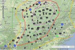
The severe weather outbreak yesterday was EXTREMELY well forecast with the rare HIGH risk designation used. The folks @ the SPC did as good as you can do with alerting those who had control of the message in terms of warning the public about the possibilities. This map shows the number of reports within the outline of the severe weather risk.
Within the purple outline is the HIGH risk of severe weather, within the red outline is the MODERATE risk of severe weather and finally within the YELLOW outline is the SLIGHT risk of severe weather. One click on the graphic shows the near perfect forecast from the SPC folks, and they should be commended!
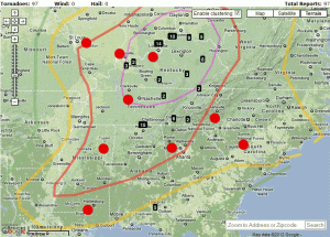
There were some 97 reports of tornados. As I always remind you, that number should come down some 30% as multiple reports of the same tornado are whittled away from that initial number. If you see a tornado 1 mile away and your friend in the next subdivision sees it too and you both report it, it goes down as TWO tornado reports even though it was the SAME tornado. So when the reports are then filtered out…the number is reduced. This will happen a lot during these outbreak days…as much as 30% from the final number, which in yesterday’s case was at least 97.
Now let’s look at the same map above with just the tornado reports. There are some individual red dots on the map representing lone tornado reports.
In both maps the numbers int eh black boxes represent the number of tornado reports from a particular tornado.
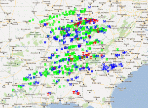
In terms of the specific reports of severe weather, take a look. The green H’s mean hail, the blue W’s mean wind and the red T’s mean tornado. This map has filtered some the reports a bit so as to eliminate multiple reports of the same phenomena. That feature has knocked down the tornado reports to 81.
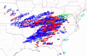
The local NWS offices also did a spectacular job in a situation where the tornados were moving at close to 50-60 MPH. That means warnings have to cover a lot of territory and various parts of the warnings constantly updated based on the fast movement of the storms. Here is a look at the warnings issues this week by the local offices.
The blue boxes mean Severe T/Storm warnings and the red boxes mean Tornado Warnings.There were some 413 tornado warnings & 569 t-storm warnings issued over past 7 days. Yesterday alone the NWS issued 279 Tornado Warnings & 357 Severe Thunderstorm Warnings
The number of tornados in one day is unusual for March. This may have been the largest March outbreak since 2006. The folks @ ustornadoes.com put together a great March tornado climatology report. Take a look. In a nutshell the long term average since 1950 for the month is about 59. They also have compiled a good number of youtube videos of the tornados themselves. We may have eclipsed that number just yesterday alone! By the way the largest tornado outbreak in March was back in 2006 with 74.
The NWS in Paducah just posted some radar pictures from the tornados on 2/29 and again on 3/2. Pretty vivid examples of radar detected tornados.
Joe


